Developing Your Street Photography Editing Style: From RAW to Final Image
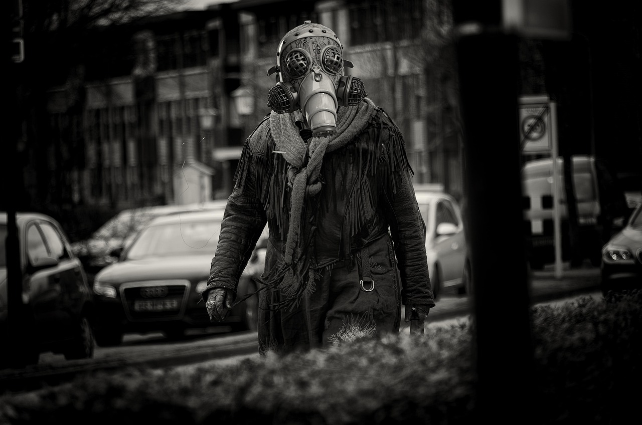
Editing is the second half of street photography — the RAW file you capture is the raw material, and the editing decisions you make determine the final emotional and visual character of the image. The most enduring street photography has a consistent visual voice that comes from intentional, repeatable editing decisions rather than applying different looks to each image. Here is the honest guide to developing your editing style.
The Case for Developing a Signature Style
A consistent editing style serves several functions: it creates a cohesive body of work that reads as a coherent vision rather than a collection of experiments. It allows viewers to immediately recognize your work. It removes decision fatigue — when you have a defined style, editing each image is applying your vision rather than deciding what the image wants to be. The risk: a signature style can become a cage if it is applied regardless of whether it serves the specific image. The best photographers have a recognizable visual voice that is flexible enough to serve each image rather than forcing every image into the same mold.
Building Your Black and White Conversion Style
Black and white street photography requires understanding how colors convert to gray tones and how to use channel mixing to control those conversions. The decisions that define a black and white style: contrast level (high contrast for graphic, dramatic images vs low contrast for more documentary, film-like rendering), shadow treatment (how deep to push the blacks — crushed blacks for graphic impact vs lifted shadows for more detailed rendering), highlight treatment (pure whites for stark impact vs reduced highlights for retained detail), and grain (amount and character of added grain for film simulation). These decisions define the tonal character of your work more than any individual adjustment.
Developing Color Street Photography Style
Color street photography has its own range of stylistic approaches: the documentary approach (minimal processing, accurate color rendering, close to what the camera captured), the cinematic approach (specific color grading that references film stock or cinema), the vibrant approach (boosted saturation and contrast for immediate visual impact), and the muted/faded approach (lifted blacks, reduced saturation, that deliberately washed-out look associated with film photography and lomography). The decision between these approaches is partly aesthetic preference and partly subject matter — certain subjects and locations suit certain color treatments better than others. Testing your images with different approaches and noting which consistently resonates is how you discover your color instincts.
Honest Bottom Line: A consistent editing style creates a cohesive body of work, builds visual recognition, and removes per-image decision fatigue — but should be flexible enough to serve each image rather than forcing every image into the same mold. Black and white style is defined by contrast level, shadow treatment (crushed vs lifted), highlight treatment, and grain character. Color style ranges from documentary (minimal processing) to cinematic (film-stock grading) to vibrant (boosted saturation) to muted/faded (lomography aesthetic). Develop your style by testing different approaches on your existing work and identifying which consistently resonates with your own vision — then apply it with intention and flexibility.