Interior Design [2026]: The Rules That Actually Work and the Trends Worth Ignoring
![Interior Design [2026]: The Rules That Actually Work and the Trends Worth Ignoring](/img/posts/fix-interior-design-honest-guide-2026-e1b59c63.jpg)
Interior design generates an enormous volume of advice ranging from genuinely useful principles to trend-driven rules that become dated within five years. Understanding which principles have lasting application and which are aesthetic preferences dressed up as rules produces more confident and more satisfying design decisions. Here is the honest guide to interior design fundamentals.
The Principles That Actually Have Staying Power
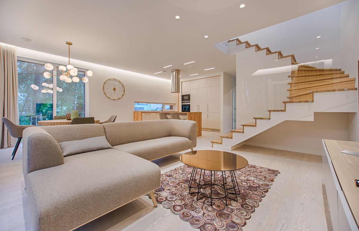
Scale and proportion — ensuring furniture and accessories are appropriately sized for the space they're in — is the principle most consistently violated in residential interiors and most consistently impactful when corrected. The most common scale error: rugs that are too small for the room or seating area. A rug should be large enough that the front legs of all major seating pieces rest on it; a rug that only sits under the coffee table leaves furniture floating in space in ways that feel disconnected. The second most common error: art hung too high, at a height that feels balanced in an empty wall but creates visual disconnection from the furniture below. Art hung at eye level (approximately 57-60 inches to the center) connects it to the room rather than the ceiling.
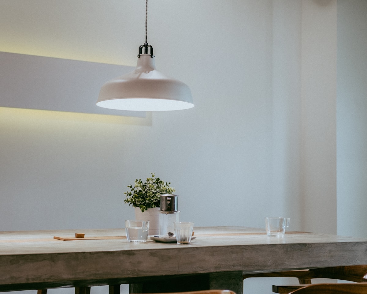
Light — both the quantity and quality of illumination — affects how every other design decision looks and feels more than most people realize before experiencing the difference. Overhead lighting from a single central fixture produces flat illumination that flattens space. Layered lighting (ambient from multiple sources at different heights, task lighting for functional areas, accent lighting for objects and surfaces worth highlighting) produces dimension and warmth. Replacing single overhead fixtures with multiple lower sources — floor lamps, table lamps, sconces — is the highest-impact single change in most residential interiors.
The Neutral Palette Question
The dominance of greige (gray-beige) in residential interiors since approximately 2010 represents a design trend rather than a timeless principle. Neutral palettes are safe, photograph well for real estate listings, and appeal to the broadest range of buyers — which is why they dominate staged and newly renovated homes. They're also frequently criticized as cold, characterless, and interchangeable. The principle underneath the neutral trend — that background colors should recede to allow other elements to come forward — is sound; its specific application (every wall in the same mid-toned greige) is an interpretation that will date.
What to Ignore
The "60-30-10 rule" (60% dominant color, 30% secondary, 10% accent) is a design school guideline that provides useful structure for students learning to think about color relationships and is widely cited as if it were a physical law. Excellent interiors violate it constantly; mediocre interiors follow it without producing interesting spaces. Rules like this are training wheels for developing color intuition, not constraints for experienced designers or homeowners.
Honest Bottom Line: Scale and proportion (furniture sized for the space; rugs large enough for front legs of all seating; art at eye level) are the most consistently violated and most impactful principles. Layered lighting from multiple sources at varying heights produces more livable spaces than single overhead fixtures. Neutral palettes are a trend response to real estate staging needs, not a timeless principle. Rules like 60-30-10 are pedagogical tools for developing intuition, not constraints that excellent spaces follow.

Isabel Torres is an interior designer, home organization consultant, and lifestyle writer who has helped hundreds of clients transform their living spaces. She covers home design, organization, smart home technology, and...
![Smart Home Interior Design [2026]: Integrating IoT Without Sacrificing Aesthetics](/img/posts/smart-home-interior-iot-2026-52c410ab.jpg)