Color Psychology for Your Home in 2026: What the Research Shows and What Is Marketing
Color psychology in interior design is one of the most enthusiastically marketed and most inconsistently evidenced areas of home design advice. Paint company marketing consistently presents color as having specific, predictable psychological effects — blue calms, red stimulates, yellow energizes — in ways that significantly outrun what the actual research supports. As a designer with nine years of experience who follows the psychology and neuroscience research closely, I want to give you the honest guide to what color actually does in interior spaces and what you can confidently ignore.
What Color Research Actually Shows
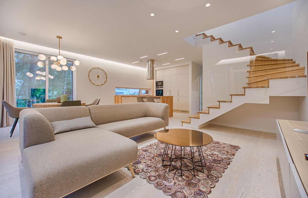
The research on color psychology is genuine but more nuanced and more qualified than marketing presents it. The most consistent findings: color temperature (warm vs cool) affects perceived temperature — rooms painted in warm colors (reds, oranges, yellows) are reliably perceived as warmer than rooms painted in cool colors (blues, greens) at identical actual temperatures. This is real and consistent across studies. Hue saturation affects perceived energy — highly saturated, vivid colors are generally perceived as more stimulating than desaturated, muted versions of the same hue. Dark colors make spaces feel smaller and more enclosed; light colors make them feel larger and more open. These effects are real and practically useful.
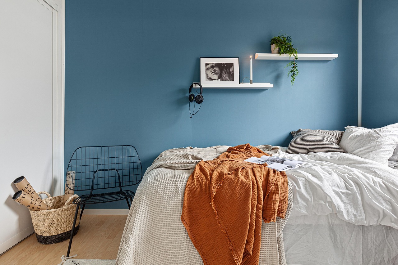
The effects that are significantly overstated: specific emotional associations with specific colors are much more culturally variable than most color psychology presentations acknowledge. White is associated with mourning in many Asian cultures and with purity in Western ones. Red is associated with luck and prosperity in China and with danger and aggression in many Western contexts. The universal psychological effects of specific colors that paint company marketing implies simply do not exist at the specificity claimed. Individual responses to color are also highly variable — some people find pale blue calming, others find it cold and uninviting, and both responses are genuine rather than one being wrong.
What Actually Determines How a Color Feels in a Room
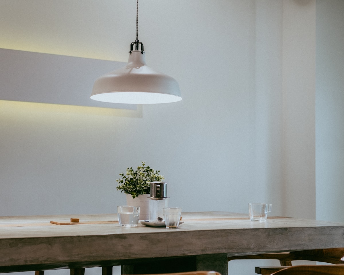
The most important determinants of how a paint color feels in a finished room are not on the paint chip. Lighting — natural and artificial — dramatically changes how colors appear throughout the day. A warm gray that looks sophisticated in the paint store under fluorescent light can look blue-gray in north-facing rooms with cool natural light, or orange-tinged in rooms with warm incandescent lighting. The light in your specific room at the times you use it most is more determinative of the color's appearance than the chip. Undertones — the subtle secondary hues mixed into paint colors — are frequently invisible on small chips but become visible when covering a large surface. The paint color that appears to be pure white on a chip often reveals pink, yellow, or blue undertones when covering an entire wall.
Adjacent colors and finishes interact significantly: a color that reads one way against white trim reads differently against wood trim, against a contrasting wall color, or against furniture and flooring. Evaluating a paint color in isolation on a chip in a different space than where it will be used is the most common source of paint color disappointment. The practice that produces the most reliable results: painting large samples (at least 12" x 12") on the actual wall you intend to paint, observing them at multiple times of day and in the room's artificial lighting, and living with the sample for several days before committing.
The Practical Color Principles That Work
The principles with the most consistent practical application: value (light vs dark) is more important than hue (the specific color) for determining how a space feels — a light purple creates similar spaciousness to a light green, while a dark purple and a dark green similarly make a space feel more intimate and enclosed. Choosing a color family and varying the saturation and value within that family (using different tones of the same base color in adjacent spaces) creates coherence without monotony. Ceiling color has a significant effect on perceived ceiling height: painting the ceiling the same light color as walls makes the room feel taller; painting the ceiling a darker color makes it feel lower and more intimate. Understanding these principles is more useful than trying to select colors based on specific emotional associations.
Honest Bottom Line: Color research supports: warm colors make spaces feel warmer (real, consistent), high saturation is more stimulating than muted, dark colors feel smaller/more enclosed, light colors feel larger/more open. Overclaimed: specific emotional associations with specific colors are highly culturally variable and individually variable — universal psychological effects at the specificity paint marketing implies do not exist. The most important determinants of how a color feels: your room's specific lighting at specific times (more determinative than the chip), undertones (invisible on small chips, visible at scale), and adjacent colors and finishes. The practice that works: large painted samples (12" x 12"+) on the actual wall, observed at multiple times of day, for several days before committing. Practical principles: value (light vs dark) matters more than hue; ceiling the same color as walls raises apparent ceiling height.

Isabel Torres is an interior designer, home organization consultant, and lifestyle writer who has helped hundreds of clients transform their living spaces. She covers home design, organization, smart home technology, and...
![Smart Home Interior Design [2026]: Integrating IoT Without Sacrificing Aesthetics](/img/posts/smart-home-interior-iot-2026-52c410ab.jpg)
![Interior Design [2026]: The Rules That Actually Work and the Trends Worth Ignoring](/img/posts/fix-interior-design-honest-guide-2026-e1b59c63.jpg)